Design trends speak our stance; the opinions and attitudes we embody. All industries, from fashion, law, farming, education and many more, use these design trends to communicate and market themselves. These design trends advance in response to cultural changes, trending aesthetics, and technological advancements. Needless to say, it is a hugely influential factor in all industries.

With the start of a new decade, design trends in 2022 have reached a significant milestone and are transforming how brands communicate. It’s the dawn of a new decade, and design is poised to reach new heights as designers begin to define the era. There’s a feeling in the air that anything can happen—that we are about to witness the next evolution of graphic design as we know it.
Although it might take a few more years for the 20s to hit their stride, designers are already showing us glimmers of what is to come. Let’s look at the reigning top design trends of 2020 that are already starting to characterize this new decade.
1. Intensifying minimalism

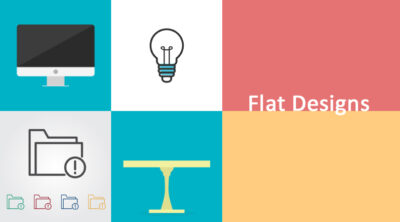
Design trends that are so complex have become too cliche. When web design was still a growing concept, designers were all excited to play around with their creativity and develop complex designs with so many interconnected and interdependent components, such as intricate 3D graphic designs. However, in the latter half of the 2010s, we’ve seen minimalist, flat design dominate the digital world. In line with marketing’s ongoing quest for transparency and honesty, this design trend will continue to strip away extra flair and embellishment and move toward a simpler, straightforward presentation. Actually, it is currently the leading design trend for web designers because of its simplicity and free from clutter.
Why flat design?
Flat design’s main benefit is allowing users to quickly interact with interfaces and find the content they’re looking for while stripping away aesthetics but maintaining functionality. Users are now looking for convenience, and the minimalistic design trend offers convenience by eliminating the complexity in the visual content, thus providing users with a smooth user experience.
While the flat design is known for being cold and unfeeling, it needn’t be so. Grady Britton’s senior art director Adam Murdoch believes that design minimalism will shift toward the warm and cozy, with interactive design’s white-and-light, luxury brand color palette going warm and friendlier; and beige, sage, and pale yellow showing up more frequently.
2. Abstract 3D and vibrant colors
Abstract 3D and vibrant colors have turned up to be very distinguishable design trends in the digital creative world, fascinating the audience and the designers with their visually striking presentations. This design trend entails the process of creating visual elements that have depth, texture and dimensionality.

Over the past year, abstract 3D design trend forms have become popular against the backlash of minimalist designs. For instance, most software companies have revolutionized this design trend by rendering 3D designs when pushing updates.
Video: Greenwich Peninsula: The Tide
The popularity of this design trend can be credited to the evolution of technology, especially in the sense of computer-generated imagery and 3D modelling software. In the past few months, most designs have created a 3D feel by combining layers of typography, images, and abstract shapes, often reflective of the company branding, to create depth. This is often paired with bright, vibrant colors and gradients, which we believe will also become a strong trend next year. This design trend can be used in advertising, product design, web design and graphic design, among other areas.
3. Type-only approaches

Type-only approaches as design trends are distinguished by their minimalistic style. This is because they focus on the arrangement of numbers, letters, and symbols to to make written language appealing, readable and communicative. Recently, the number of companies adopting typography approaches as their graphic design trends instead of images appears to be growing. There has been greater use of typography and bespoke typefaces as defining elements in branding.
This design trend has also proven to be highly effective by emphasizing typography’s ability to play around with different font styles, sizes, weights and formats to help brands deliver messages via simple, solid, and singular statements yet invoking. It’s a good design trend for brands that are straight-talking and to the point.
From digital lifestyle brands like Uber, we are seeing a softening and a simplicity through their more approachable typography with fewer capitals, more circular letter forms and clean, naturalistic icons. In recent campaigns from Nike and Adidas, we’re seeing greater honesty to styling and photography, focusing on real individuals in less staged environments, reflecting a desire for more one-on-one conversations.
Moreover, this design trend is particularly convenient in responsive and mobile design contexts, where space constraints may limit imagery or other visual elements. By prioritizing typography, designers can ensure that their designs remain legible and engaging across different devices and screen sizes.
4. Mobile responsive and progressive designs

Your website design can significantly affect your company’s traction and growth. Having a more user-friendly website can limit the bounce rate and motivate visitors to stay and engage with your content.
Do you develop a website that works across all devices or make a device-specific app that only works on that specific device, such as the iPhone? Harry East, the co-founder and creative director at Equals Collective, believes that you’ll increasingly need to do both in the coming year. That aside, creating websites that only work on one device limits your reach a lot as it is limited to those audiences that use that device only.
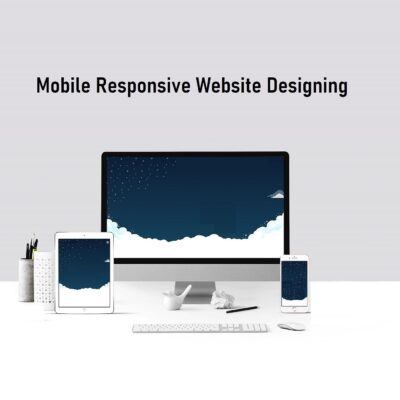
In 2020, we’ll continue to see the chasm widen in responsive design trends. A responsive web design focuses on providing a user-friendly experience despite the device the user is using. Although styled similarly as to the device-specific design trend, the designed experience will become fully tailored for the platform consuming it.
Expect to see websites and apps designed with unique experiences for each format. Our experiences are perceived differently depending on how they are viewed and used. The best web experiences will be defined by their ability to meet this new design challenge and captivate an audience with specific designs matched to experiences across different platforms.
5. Backlash against Insta-perfection

Is the Instagram-inspired notion of showing idealized versions of ourselves on its way out? “Lately, we’ve seen a massive shift in how brands portray people so that audiences feel a more genuine connection. Social media is flooded with everyone trying to be as perfect as possible. No one wants to be perceived as flawed, which builds a fake sense of perfection since no one is perfectly perfect. What most people don’t realize is it is through our imperfection that perfectionism lies.
Brands are now realizing the power of celebrating their consumers instead of promoting just one outdated aesthetic. This has been mainly happening within the beauty and fashion sectors, but I think we’ll see it expand across different sectors in 2020. This is a revolutionary design trend as people tend to relate more to down-to-earth content as it makes them feel seen.
In a backlash against the image-obsessed, overly filtered selfie culture, we have seen the rise of un-retouched imagery, using real people over models and representing truer diversity.
6. Organic look and feel

An organic look and feel design trend is quite similar to minimalistic design; however, this design trend combines minimalistic design with boho decor elements such as warmth, naturality and free-spirited aesthetics. It is simple but with functionality.
Throughout the 2010s, we’ve seen more and more brand and packaging designs focus on the organic, the calming and the natural. And right now, that trend is only heightening.
Equity and CBA Loop, banking old and new, are embracing softer, more naturalistic color palettes and stripped-down illustrations, a big step away from the authoritative and autocratic banking of old. And we’re seeing technology product companies adopting aesthetics and materials inspired by nature and in tune with our homes. Rather than the shiny black tech, monoliths of old, soft forms and exciting textiles are being combined.
7. Storytelling

When it comes to design trends in 2020, brands need to learn and adopt them in their work and designs. This will enable them to be at the forefront of communication and, in turn, expose their brand to a lot more people.
