Is minimalistic design the hottest trend in 2024?

Everybody is talking about how minimalistic design is the hottest trend in 2024, revolutionising how we interact with digital interfaces. The real question should be, is it really all that? That it isn’t just the hottest design trend but the future of UI design?
In the vast prospect of design trends, where constant change and complexities are the language, minimalistic design seems to reign, offering a timeless antidote of simplicity and elegance. For a minute now, people have been fascinated by the likes of computer graphics animation and complex interconnected design trends, but just like any trend, when consumers and designers get enough of it, it’s not unusual to see another trend rise.
This stripped-down, sleek approach to design has captured the hearts and minds of designers and consumers, revolutionising everything from website design and graphic design to architecture. In this article, we’ll look into why minimalistic or flat design is not just the hottest trend in 2024 but a fundamental move in the way we perceive and interact with the world around us.
What is minimalistic design?
Minimalistic design, the hottest design trend in 2024, has gained massive popularity across various creative fields. Originating from the minimalistic art movement of the late 1960s, exemplified by Bauhaus and De Stijl, this approach is all about simplicity and functionality. At its core, minimalistic design, also known as flat design, emphasizes on achieving more with less. This style highlights the fundamentals, removing all unnecessary elements to create a clean and uncluttered view.
Initially an art movement, the minimalistic design trend has now transcended into websites, graphic designs, architecture and even lifestyles. It is this simplistic yet functional nature of minimalistic design that makes it the hottest trend in 2024. It offers a breath of fresh air amidst the chaos in this world, saturated with information and stimuli. Just like any other design trend, the minimalistic design trend is guided by several principles:
The main principles of minimalistic design trend
- Simplicity: simplification is the heart of a minimalistic design. Let the question, “Is this really necessary here?” guide you. Designers prioritize simplicity in their creations, focusing on the most straightforward approach possible. Simplicity is what enhances user experience and facilitates effective communication in the minimalistic design.
- Less is more: With this guiding principle, designers purpose to achieve maximum impact with minimal elements, extracting unnecessary segments that distract the viewer from getting the precise message intended to be passed across. The minimalistic design is the hottest trend in 2024 because of the focal point that enhances the designer’s power that this approach creates.
- Functionality: Every element in a minimalistic design serves a purpose. In whichever design, whether in architecture, product design, or web design, only the core elements and colors are retained. The superfluous elements are eliminated to maintain simplicity and clarity. Being intentional when adding new elements is very important to help you avoid cluttering the space.
- Color: The fewer colors used, the better, and neutral colors such as white, black, and grey are even better. By adhering to a limited colour palette, minimalistic designs can achieve focus and clarity while allowing other design elements to be highlighted.
- Typography: Typography plays a pivotal role in minimalistic design, serving as a cornerstone for conveying messages with clarity and elegance. Here, the choice of fonts significantly influences the overall visual impact of user experience. The minimalistic design trend favors the use of simple, clean fonts over ornate or decorative ones. What highly contributes to minimalistic design being the hottest trend in 2024 is how its use of simple fonts ensures legibility and readability, key elements in effective communications.
The Rise of minimalistic design trend in Graphic design
In the ever-evolving landscape of graphic design, the one trend that stands out as the epitome of sophistication and functionality is the minimalistic design trend. Characterized by simplicity, clean lines, ample white space and an emphasis on the fundamental elements, minimalism has risen to prominence, revamping the visual landscape of various mediums, from advertising to web design.
As we look into the hottest trends in 2024, it’s with no doubt that minimalistic design has transcended mere fashion to become an essential philosophy guiding modern aesthetics.
Generally, minimalistic design in graphic design reflects a timeless pursuit of clarity, functionality, and elegance. By embracing simplicity and purpose, designers continue to push the boundaries of creativity while delivering impactful visual solutions across various channels. As we navigate a progressively digital world, the enduring appeal of minimalism remains as relevant as ever.
Minimalistic design trend in UX/UI design
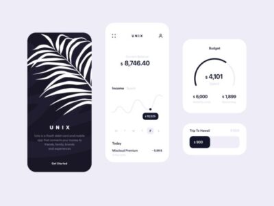
Over time, the coming together of technological advancements, changing user preferences, and design philosophies have helped minimalistic design emerge as the hottest trend in 2024. Minimalistic UI design is rooted in the early days of digital interfaces when skeuomorphic designs dominated the scene with their realistic textures, shadows and reflections.
At the heart of the minimalistic UI design trend lie several concepts that make it the hottest trend in 2024. The principles are clarity, simplicity and consistency.
Simplicity entails stripping away unnecessary elements to convey information and functionality as straightforwardly and efficiently as possible. The minimalistic design prioritizes readability and usability.
By maintaining consistency through sticking to established design patterns, color schemes and typography guidelines, the minimalistic design fosters a sense of familiarity and confidence in users. This promotes their overall satisfaction and trust in the product or service, contributing to its being the hottest trend in 2024.
Why is the minimalistic design the hottest trend in 2024?
Negative Space
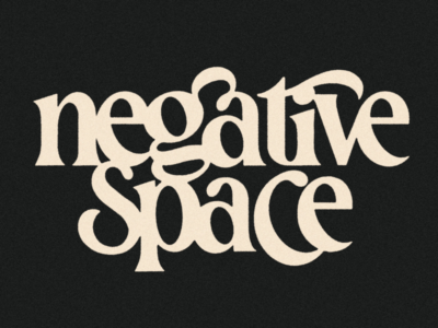
Also known as white space, a concept often misunderstood as empty or void, it is a magnificent tool for designers to enhance user experience and communicate information effectively. It focuses not only on the subject but also on the space around it. The negative space needs to offset the positive space, creating a balance.
This concept in the minimalistic design trend focuses on embracing the white space or void separating or surrounding the graphic elements. This space accentuates contrast, maintains balance, and fosters harmony within the composition. By taking advantage of the negative space, designers can form shapes, weave patterns, and infuse symbols that permeate the design with significance and dimensionality.
Playing around with the negative space allows crafting designs that are not only imaginative but also captivating and unexpected, making minimalistic design the hottest trend in 2024.

Consistent Textures and Tones
The strategic use of consistent textures and tones infuses designs with depth and character while maintaining a sleek, uncluttered appearance. All the textures introduced in your design should be of the same tone while retaining the same color scheme for your design.
Textures are paramount in minimalistic designs to add visual interest without compromising their clean aesthetic. Whether it’s through subtle patterns or tactile elements, textures such as gradients and soft shadows bring flat compositions to life. In graphic design, texture and tone are seen as subtle grain overlays or delicate brushstrokes, while web designers may exploit textures and tone through carefully crafted backgrounds or subtle hover effects.
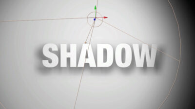
Just as in interior design, where textures should align with a room’s dominant color palette, graphic and web designers must ensure that textures and tones harmonize seamlessly with the primary colors and visual elements of their designs. By carefully coordinating textures and tones, designers can achieve a delicate balance between simplicity and sophistication, creating visually striking and highly functional designs.
Typography
Typography in minimalism aims to create a clear and legible visual hierarchy, using contrast, alignment, and spacing to communicate the critical message. This style uses simple and easy-to-read fonts with minimal or no embellishments, such as serifs, ornaments or scripts.
To achieve a minimalistic design using typography, you should consider:
- Limiting the number of fonts: by restricting the number of fonts you choose to use, you maintain visual cohesion and avoid cluttering.
- Harmonizing fonts: Ensure that the fonts look good together to make the graphic visually appealing, with a pinch of simplicity to promote the overall aesthetic appeal of the graphic.
- Choose simple, clean and easy-to-read fonts: A minimalistic design is characterized by its straightforward fonts with unnecessary embellishment to enhance readability.
- Go for bold or thin letters depending on the theme: Depending on the type of emotions you want to evoke, you can leverage the fonts to convey that. For instance, bold letters represent confidence, strength, or emphasis, making them suitable for designs that assert a strong presence or convey authority. By carefully selecting between bold and thin lettering based on the desired feel, designers can imbue the brand’s visual identity with subtle expressions.
- Avoid unnecessary text decorations: A minimalistic design must avoid unnecessary text-decoration to maintain the clean and uncluttered aesthetic that characterizes this approach. By forgoing embellishments such as complex ornate flourishes, designers ensure that the focus remains squarely on the essential elements of the text itself. This adherence helps designers reinforce the functionality of the design since the absence of distractions allows for more precise communication of the brand’s message or content, contributing to why it is the hottest trend in 2024.
Below is an example of an ornate flourish in typography;

In conclusion
In the landscape of design trends, minimalistic design has risen to distinction as more than just a fleeting fashion statement: it represents an underlying shift in how we perceive and interact with the world around us, particularly in digital interfaces. This approach’s anthem is achieving more with less.
In graphic design, minimalism has transformed the visual landscape, emphasizing clean lines, ample white space, and fundamental elements to deliver impactful solutions across various mediums. Similarly, in UI design, minimalism prioritizes simplicity, clarity, and consistency, fostering familiarity and trust among users.
What sets minimalistic design apart as the hottest trend in 2024 is its ability to harness negative space, consistent textures and tones, and typography to create visually striking yet uncluttered compositions. By leveraging these elements, designers can craft imaginative and captivating designs while maintaining a clean aesthetic.
Ultimately, minimalistic design is more than just a trend. It represents a timeless philosophy that resonates with the modern values of simplicity, functionality, and sustainability. As we progress in this complex digital world, minimalistic design is a guiding principle for creating simple yet rich designs. Here at Madavi, it is our to-go and all-time design because it effectively communicates the brand’s essence and avoids unnecessary confusion. Without a doubt, minimalistic design is the hottest trend in 2024.


