Influence of design on the usability of applications
Should you create an app with a good experience or a better design? An app’s look and feel on the first interaction greatly affects usage going forward. At first glance, the user will feel right at home and keep using it or bail out. According to a study, globally, the mobile app uninstalls rate after 30 days is 28% meaning the app uninstall rate means almost 3 in every 10 apps will be deleted from users’ devices within a month.
Another stat is 21% of apps are used only once during the first 6 months. Don’t sweat it, stats also show 57% of re-installs occur one month after uninstalling for travel apps, 20% for media apps, 75.7% for productivity apps, 66.67% for social apps, and 55% for gaming apps.
This simply shows how crucial it is to prove the value of your app within the first few days.
The number of available apps in the Google Play Store was most recently placed at over 2.5 million apps, for app store at over 1.8 million, and windows at over 500,000 as per stats from Statista
This means your app will be competing with these apps for attention. You need to deck your app only with tools and features that help users to achieve their objectives from the app.
The average user spends 5 hours per day on mobile. The vast majority of that time is spent on apps and on websites. The difference between a good app and a bad app is usually the quality of its user experience. Users expect fast loading, good interaction, ease of use, and convenience.
Any setback leads to uninstalls. Uninstalls are one of the dominant factors that adversely affect the success of an app. Below are some of the reasons why users remove apps and ways to avoid the pitfalls with good design practices.
Why Do Users uninstall apps?
- Lack of space. Users will most often look through their apps and remove the least frequently used app. As the provider of the app, you want to be on top of the most used.
- Poor user experience. The app may have too many bugs, unmet expectations, a confusing user interface, and too many features(Yeah it’s a thing).
- Lack of value. A user needs the app to provide real value and not just be an app. An example of an e-commerce app with only two sweaters yet the user needs socks.
- Poor engagement. The app bombards the user with a lot of notifications and emails making itself an annoyance.
- Privacy concerns. As an app, the privacy of the user is sensitive in this age, and requesting certain permissions will make most users uncomfortable
Most of these factors can be put in check early on with good design practices. These design practices gave to the rise of UI and UX.
User Interface
The “UI” in UI design stands for “user interface.” The user interface is the graphical layout of an application. It consists of the buttons users click on, the text they read, the images, sliders, text entry fields, and all the rest of the elements the user interacts with. It’s based on the layout which is how the elements are displayed, the visual design which is how the elements are used to look, and branding which is how the app is associated with.
User Experience
“UX” stands for “user experience.” A user’s experience of the app is determined by how they interact with it. Is the experience smooth and intuitive or clunky and confusing? Does navigating the app feel logical or does it feel arbitrary?
Does interacting with the app give people the sense that they’re efficiently accomplishing the tasks they set out to achieve or does it feel like a struggle? It’s based on research on what users want to feel on interaction, its usability, and the personalization of the experience to the user.
Even if you have made a useful mobile application that people find compelling, its popularity may remain low for one simple reason – it’s just not convenient to use. Therefore I’ve curated a list of best practices to avoid the common pitfalls.
Best Practices for Design
Optimal Functionality of screens
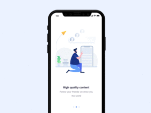
Avoid placing all possible actions and functions on one screen, and split them into several steps instead. Take an example of the onboarding process of the user to get the whole idea of what the app does, or the process of booking a taxi. The user is taken through the process of payment and booking is seamless.
The app design below is a representation of optimal functionality. Users immediately realize what is required of them when they have only two options for further action – either to take a step forward or to go back.
Design Guidelines
Design guidelines are sets of recommendations on how to apply design principles to provide a positive user experience. Designers use such guidelines to judge how to adopt principles such as intuitiveness, learnability, efficiency, and consistency so they can create compelling designs that meet and exceed user needs.
These arose from inconsistencies in designs across different devices. Material design guidelines and Apple’s Human Interface Guidelines for mobile design are the most commonly used. They are easy to read with a beautiful layout and are peppered with best practices, tips, and Apple’s and Google’s own take on design principles. There are others available but the two are the most commonly used.
Consistency across devices
Whether a user is accessing content on an app, mobile website, or desktop website, the transition between using them needs to be seamless. The design elements should mirror one another (designers shouldn’t use blue for the app and red for the website, for example).
Not only does a seamless experience make things easier for people using a website or app, but it also builds trust with the brand.

Focus on Speed
People’s patience for a cumbersome and clumsy mobile site or app quickly wanes. They expect to move through a brand’s mobile experience quickly and seamlessly. Not only should the app be able to cater to slow speeds in case it uses the internet but also its functionality should be seamless.
If you’re looking to have an app developed for slow internet, looking into offline caching mechanisms is a great way to allow access and keep users engaged. Sometimes these factors are beyond us so allow the app to give feedback in case of any issues appropriately.
Fun fact: 29% of smartphone users will immediately switch to another site or app if it doesn’t satisfy their needs (that is, they can’t find information or it’s too slow). In fact, of those who switch, 70% do so because of lagging load times. And 67% will switch if takes too many steps to purchase or get the desired information.
Provide Feedback to Users
Giving users feedback as they perform actions on a mobile app is an important aspect of a positive user experience. Animations and transitions are one way to give feedback. Providing touch feedback when certain actions are performed is particularly popular with mobile games, and also with error messages. Audio feedback is great but most users keep their phones silent.
Minimization of Input
Typing on a small mobile screen isn’t the most comfortable experience. In fact, it’s often error-prone. And the most common case of user input is filling out a form. The more data a person has to enter into a mobile app, the more likely they are to abandon the task.
Here are a few practical recommendations to make this process easy:
- Keep forms as short as possible by removing any unnecessary fields. The app should ask for only the bare minimum of information from the user.
- Provide input masks. Field masking is a technique that helps users format inputted text. A mask appears once a user focuses on a field, and it formats the text automatically as the field is being filled out, helping users to focus on the required data and more easily notice errors.
- Use smart features such as autocomplete. For example, filling out an address field is often the most problematic part of any registration form.
- Dynamically validate field values. It’s frustrating when, after submitting data, you have to go back and correct mistakes. Whenever possible, check field values immediately after entry so that users can correct them right away.
Put The User In Control
Personalization should push users toward content that they’re looking for and away from content that’s irrelevant to them. It can also eliminate distractions on the site, streamline components like the purchase process, and make sure that marketing messages are in sync with what the visitor actually wants. This is effectively done during the onboarding process where the user is allowed to select what they want to see, or via settings to allow the user to customize the look of the app. If not possible, please keep the elements of distraction like ads minimal.
Avoid Jargon
Use clear and concise icons and feedback messages from your app and site. Some icons are easily identifiable like home and settings icons. If using icons, consider using text also to allow the user to know what they are interacting with at the moment.
Errors occur when people engage with apps. Sometimes, they happen because the user makes a mistake. Sometimes, they happen because the app fails. Whatever the cause, these errors and how they are handled have a huge impact on the user experience.
Bad error handling paired with useless error messages can fill users with frustration and could be the reason why users abandon your app.
Don’t assume users are tech-savvy enough to figure things out. Always tell people what’s wrong in plain language. Each error message should tell users:
- what went wrong and possibly why,
- what’s the next step the user should take to fix the error?
Development Process
No matter how good a design is, if the process of development and the technology used does not match up, the app will have setbacks during usage, therefore, causing lowered expectations.
In the current age, several technologies have come up to help design and develop apps and sites better. I’ve curated the best currently available. Please note these views are based on research and personal experience.
For Designers
There are several tools that have risen up to challenge the juggernauts in the industry but so far the following have withstood and dominated the market. Feel free to experiment with each as they offer free tiers to find suitable tools for you.
Sketch Tool. Sketch is a digital design app for Mac. You can use it for UI, mobile, web, and even icon design. You can even use Sketch for wireframing, or with the help of some plugins, you can use it for prototyping. You can read more about it at Sketch Link
Adobe XD. Adobe XD is a vector-based user experience design tool for web apps and mobile apps, developed and published by Adobe Inc. It is available for macOS and Windows, although there are versions for iOS and Android to help preview the result of work directly on mobile devices. You can read more about it at Adobe XD Link
Figma. Figma is a vector graphics editor and prototyping tool. It is primarily web-based, with additional offline features enabled by desktop applications for macOS and Windows. The Figma Mirror companion apps for Android and iOS allow the viewing of Figma prototypes on mobile devices. You can read more about it at Figma Link
Zeplin. Is a collaboration tool, built for UI designers and frontend developers. With Zeplin, the collaboration between designers and developers becomes easy, and effective, and saves time. Designers can turn their designs into specs and guidelines, and developers can generate platform-related code snippets.
For Developers
As a developer, it’s challenging to keep up with the always-evolving technology. In reality, I’ll advise in simple terms I was told in the beginning of my journey:
Find a language you like and stick with it to the end.
Only add a language once comfortable with the current one.
In mobile development, there are several ways to develop an app. Using web technologies, using native technologies, hybrid technologies, and app builders. Each has its own limitations and advantages so feel free to explore and find the right fit.
Web Technologies.
Progressive Web Apps are the latest trend for websites and also in a way apps. This way allows you to develop an app both for the web and also can be installed as an app. PWAs are becoming so popular, that Google, Apple, and Microsoft are starting to accept PWAs as native apps in their App Stores. Accelerated Mobile Pages (AMP) were created by Google and are considered to be mobile pages distilled down to their bare essentials using Google’s JavaScript and HTML-specific tags.
Hybrid Technologies.
Hybrid Mobile app frameworks make work quite easy for mobile app developers as it’s easy to build a single app that performs efficiently on numerous platforms such as iOS, Android & windows with no extra effort. Also, there are so many advantages of the Hybrid mobile app frameworks which include cost-effective app development, access to a wide range of numerous hardware/software capabilities & probability.
To explore the current best frameworks the Best Hybrid Frameworks website that gives a comprehensive breakdown of the preferred frameworks and their targets. It offers the best of all worlds in advantages.
- Single code base – This is the advantage that causes all the following benefits. These apps are preferred by companies and developers as they can perform on both platforms. There will be no need for building two separate codes for iOS and Android by reason of the code’s common functionality.
- Lower cost –The company can make huge savings by developing one mobile application while addressing users on different platforms. You have the necessity to hire one team with some expertise in both but only good expertise in web development would be enough. Your expenses will be almost the same as building only one that is designed to run everywhere.
- Simpler to build and test – The team will reach the expected result faster. They don’t deal with each platform separately. The code is created once and testing time is also going to be reduced.
- Easier to maintain – All required changes and updates will be maintained simultaneously on both platforms. It is not only convenient for the developers but for the users as well. A lot of issues are possible to fix from the server side, and the user will just get the updates automatically.
- Faster delivery time – You don’t need to have two iOS and Android teams or a large cross-functional team, you just need to find one relatively small team of professionals. They can create a cleverly marketed product that will be interesting for different users. The hybrid applications have recommended themselves as content-oriented.
Native Technologies
Native apps are developed in a platform-specific programming language, making them compatible only with the corresponding platform. Android apps are developed primarily in Java and Kotlin, whereas iOS apps are developed in Apple’s Swift. The native technology is superior but offers resolute disadvantages.
- Time and money-consuming – It definitely requires time to build complex software. The distribution of users across two main platforms doubles the amount of work and testing needed to keep two separate applications for both iOS and Android up and running.
- Distributed codebase – Having some features unavailable for iOS or Android is an infamous practice that has its place even in 2019. This happens due to limitations in the budget or restrictions of the platform. Sometimes, applications in the App Store can be abandoned for years while the Android version receives regular updates and vice versa
Conclusion
All in all, choosing the right framework and tools will help build a great design that enhances the experience of the app. A great design combines both beauty and functionality and that’s what you should be aiming at. Provide an app with both of these and continually evolve it with feedback from users and research and sit back, relax and watch the magic of success. 🙂 🙂
Ready to take your business to the next level? Read about proven website marketing strategies to grow your business